Reveal day is finally here! We've been talking a lot about transforming the front room of our house into a functioning office — and today, we're sharing all the details surrounding how things are shaping up. To get a sense of how the room looked before, see images along with our reasoning for transforming the space in this post — and scroll to the bottom of today's post for a look at how the space has evolved since first moving in.
So without further chitchat, here are some more progress shots from different angles of the room:
Looking straight in, towards the right (the view everyone will see when first entering our home).
Looking out towards the front entry from the back of the office.
Looking straight into the room from the front entry.
We're excited to say we made a solid transformation and are at a good "progress" point. The best part is — we're using the space as an office (the main reason for the update). We still have a few key pieces we'll need to bring in before calling it a done deal, like a larger area rug, two tall bookcases on either side of the fireplace, a storage cabinet for our printer, and possibly some additional seating, but all in all, we're thrilled with the current outcome. Keep reading for the full rundown and little details for how we got it done.
*As a side note, since we tackled this room transformation over the span of probably 3-4 days, you'll notice lots of "wardrobe changes" throughout — I'm sure there's a joke in here somewhere about a drinking game for each time you notice Tim in a new outfit...
To get started, we cleared mostly everything out of the room, beginning with the curtains, to not only give the space a deep clean, but start over with a fresh outlook from ground-one.
Once everything was cleared out, it gave a chance to evaluate all the new pieces we'd been collecting for placement, and decide on new arrangements for the pieces we wanted to keep in the room.
Probably the biggest improvement was updating the window treatments. I couldn't have been happier to bid those heavy and shortened yellow blackout drapes goodbye. As soon as Tim removed them and the window hardware, the room seemed to just fill up with bright light.
We both wanted a more streamlined feel for this wall and windows, so we installed a single rod that extended the full length of the wall. To add visual height, we installed the rail above the window frames, allowing for full 120" length floor to ceiling sheers.
I think this qualifies as Tim's not amused face — "Mary, please put down the camera and hand me the screws..."
After the sheers were in place (thanks honey!), I spent time steaming the wrinkles and folds out of them using our handheld steamer. Love this thing:
The floor to ceiling length and sheerness of the panels just feels so dreamy.
So yes, the curtains have been the biggest transformation for us — we're loving the new look and feel they bring, especially how they draw the eye all the way up:
When it came to furniture, we removed the small rug and transferred the trunk into our living room to use as a coffee table for now and the two metal chairs went back to their original place settings around the dining room table. Much to Basil's dismay, we cleared out the couch and moved it upstairs:
I think I'm noticing a pattern with these glaring expressions from my boys, ha — but it was all worth it in the end (you'll see, even for Basil)!
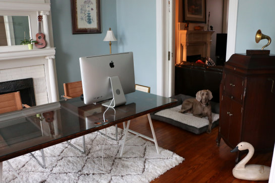
Once cleared out, we brought the record cabinet back in and slid it in front of the windows with the boxes of records:
It's been a lot of fun sliding this cabinet open, listening to records and NPR in the mornings — something we rarely did before. We also kept the Victrola in the front corner until we find or make a storage cabinet that will house our printer and other office supplies.
We knew we wanted a floating desk, central to the room, so we rolled out the rug pad and rug, placing the desk we made from an antique door, glass top and trestle legs on top (we'll detail out how we made the desk in a post early next week). It was at this point that a couple things happened:
1. Much to our laughter and enjoyment, Basil made himself right at home on the new carpet.
2. We realized this 5x7 area rug is actually too small for what we had in mind. After re-taking measurements, we now know we'll need one size up (7x9) to get the look we were going for, and as luck would have it, this specific rug is out of stock in that size. So that will be another tweak to put on the ol' never-ending to-do list.
Outside of needing a larger rug, we love the functionality of the rug pad we selected for use:
It's a Rug Pad USA 4'10" x 6'10" Exact Eco-Cushion non-slip rug pad, made with eco-friendly materials including organic polymer and soybean oils, that helps protect the floors, add extra cushioning and keeps the rug securely in place, which is great for an area where we slide chairs in and out from the desk frequently.
We couldn't be happier with how the office chairs feel and fit with the space. They are a Safco guest chair design we found online and took a chance on. Not only are they comfortable and bring a modern feel to the room, but they're made from a recycled leather material, something we can both feel good about:
In the art department, Tim hung our Virginia salt water sport fishing map above our prized and legendary cased fish in the front corner:
We left all the art we previously hung above the mantle in place, then hung the matching framed lily diagrams as pairs on either side of the mantle to create a little continuity.
We love how they look for now, and realize they might evolve in terms of placement when we get around to making and installing bookcases for these walls.
As for the smaller details, we brought in some family photos that sit nicely on the sliding top of the record player. When closed, they sit to the right and when open, they slide over to display on the left.
We also picked up a rubber plant! I've mentioned wanting one of these before, so when passing through Lowe's the other day and spotting this smaller bush version, I couldn't wait to bring it home and think it sits really well in this corner:
We paired it next to a pineapple plant we've been working to regrow from scraps (here's how you can grow one too) and even have a small fiddle leaf fig bush we ordered online that's currently in transit for this front office too. I'm not sure if we'll decide to get plant stands to add some height and dimension, but I'm sure the placement of these plants will an evolving project as bookcases get installed and we figure out the best lighting for their tolerance.
Oh, and we even ended up getting a new dog bed for Basil that matches the grays and creams of the room:
While he loved the carpet, we thought giving him his own space would be a better trade for moving his couch — and he loves it. He just curls right up in it while we're working in the office, and has even gone in there to just rest alone.
I think that's the full rundown of what we've currently got going on. Let us know if you have questions about anything we missed. For now, we're at a great pausing point and loving the new space. As mentioned before, there's still a few things like we'd like to do before we call it a done deal (like swapping in a bigger area rug, building tall bookcases and finding a storage cabinet for our printer), but we're feeling good — and we're using the room as an office, which was the main purpose for making the changes.
We're definitely feeling upgraded from how the space was oriented before:
...and even a farer cry from what this space looked like when we first moved in (remember those red walls?):
We'll be sure to keep you posted on the progress of our new office as it continues to evolve — thanks for following along!
Discover More:
Home Decor Posts | Before & After Projects
Full Disclosure: We received a free rug pad from rugpadusa.com. Our thoughts and review are true to how we feel about this great rug pad. Thank you so much for supporting the partners that make 17 Apart possible.


I am in love with this room. The colors are so inviting.
ReplyDeleteTo me, the next best thing to Basil in his bed are those chairs. You could see from the pictures how soft the leather must be to the touch.
I can't believe I missed the pineapple post. I'm definitely going to try that planting one too
Zepur ♥
Thanks Zepur, we agree — the chairs have been such a nice touch and are comfortable to sit in for long stretches of time. Definitely a piece we are happy we got!
DeleteThe colors are so inviting.To me, the next best thing to Basil in his bed are those chairs. You could see from the pictures how soft the leather must be to the touch.
ReplyDeleteThis comment has been removed by a blog administrator.
ReplyDelete