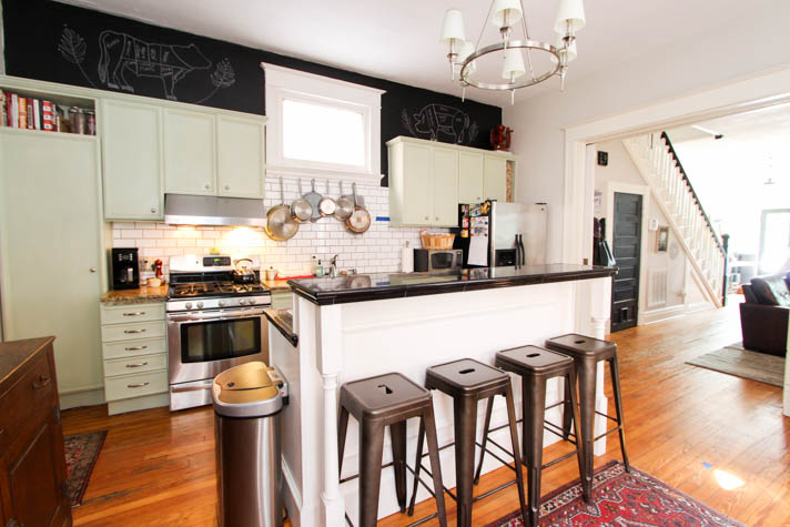
Today's post has been a loooong timing coming, friends! We're spilling all the details on our upcoming complete kitchen renovation. It's something we've been talking about for years and more seriously planning for over the past year. Well, the day is finally here that we bid farewell to our kitchen as we know it and embark on the largest renovation we've ever tackled.
Photography, Ali Williamson
Here's the thing — we love our kitchen. It's was a big upgrade from the kitchen in our previous home and its placement in the center of the house was what originally sold us on making this home ours. Like most of the row homes in this area, the kitchen would have originally been positioned in the very back of the home.
We've made so many wonderful memories in this kitchen just the way it is — family meals, hosting holidays, making many a dog treat and dabbling in my own adventures of learning how to cook on a regular rotation. We announced our engagement in this space shortly after moving in and it's the natural gathering space whenever we have company over. Because this room is the literal and figural heart of our home, over the years we've gotten a much better feel for how we actually use the space, what our needs are and what we'd change if we could.
When it came time to plan for upgrades we heavily weighed two options:
- A simple makeover within the same footprint that included light updates like painting the existing cabinets and island, upgrading the countertops and appliances.
- A full remodel and reconfiguration to accommodate our ideal use for the space along with our dream appliances like a larger 48-inch oven and oversized farm sink.
I should also clarify that when I say "we're" tackling this project, we're not actually DIY'ing this renovation. There are portions like the design and electrical where we'll play a larger role, but for the most part, we're working with an awesome team of local specialists on all the heavy lifting.
We'll put together a post with all of the renovation details ahead of us — I'm sure there will be a few surprises to come, especially with tearing out portions 100+ year old walls, ceiling, and flooring.
So! Let's talk about the design plan. We'll be upping the storage by bringing in floor to ceiling cabinets and adding more light by installing can lights, two island pendants and under cabinet lighting (oh! and we'll smooth out the ceiling while we're at it). We'll widen the overall workspace by pushing the island footprint back a bit and making it a larger single counter height. While we're talking about the island — we're planning to center the sink here (it's a farm front!); we'll also bring the dishwasher over to the island and a small beverage cooler. While we're reconfiguring the appliances, we'll make the oven the focal point of the kitchen by centering a new, bigger size on the back wall where our sink sits now. We'll take on a few areas of flooring repairs where we're edging a little too far past the point of calling the damage "old house character," ha. Finally, I know two-tone is a trend right now, but I'm looking forward to bringing in a bit of classic tranquility by making the cabinets and island a single color and all of the countertops a single matching material.
Whew! There's so much we're excited about here and just as many smaller details we're excited to share in the coming weeks. If you look closely, you'll see little marks of blue painters tape on the floor and backsplash where some of the new elements will be.
Being a visual person, I spent the past year earmarking magazine pages and saving inspiration from Pinterest and Instagram collections to organize my thoughts. The overall vibe we're going for will be historic modern — a clean updated space with modern convenience that retains some of the historical character, honoring the age of our home.
It was this kitchen by Elizabeth Roberts that stopped me in my tracks one afternoon while paging through Martha Stewart Living:
Other major sources of inspiration came from Studio McGee, GRIT & Polish and Jkath Design Build. You can get an idea of how I'm thinking about the color palette for the cabinets and countertops along the with taller cabinetry below. Also, that mix of historic style cabinet hardware paired with a modern pot filler is exactly the vibe we're going for.
Aside from the stove, the other focal point will be our sink — I mentioned earlier that we've landed on an oversized farm front style and couldn't be more excited about all the additional space we'll have for washing everything from fresh garden vegetables to the largest pots we own.
While these are the main sources of inspiration we've been running with on the design of the space, I've saved over 50 more images and ideas to this kitchen inspiration Pinterest board — feel free to follow along if you're looking for similar inspiration or are just curious to see more of what we've got up our sleeves.
We do have a design plan that maps everything we've planned out to spec in a line drawing, although I think HGTV has ruined me, because I wanted to know where our virtual reality color rendering was when we received the line drawings, ha! You know those fantastic renderings you see on shows like Fixer Upper and Property Brothers?
And! If you're curious about how our kitchen has evolved over the years, there's a whole slew of projects we've tackled in here —
- How we organized everything under the kitchen sink using a tension rod
- The DIY magnetic knife rack we built
- That time we built an exposed shelf from a wooden beam and open wall storage
- How we transformed an old army locker into an industrial style kitchen console
- Remember when we painted the walls in chalkboard paint, then later drew meat diagrams on them? We're leaving them up for a surprise just in case many years down the road someone takes these cabinets down.
- Or even further back, when we painted the walls (<----- original kitchen pic in this post)
Thanks for taking the time to check in on us today — more exciting kitchen things to come!


Thank you very much for the professional Kitchen Renovation, I had the best design for my little kitchen the Tango's designer did a fantastic jon.We love our custom kitchem, it looks awesome.
ReplyDelete